| |
 |
|
| |
||
|
|
||
|
|
||
|
|
||
|
|
||
|
|
||
|
|
||
|
|
||
|
|
||
|
|
||
|
|
||
 |
||
 |
||
| |
||
Carol's
Art
|
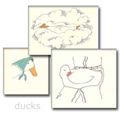 |
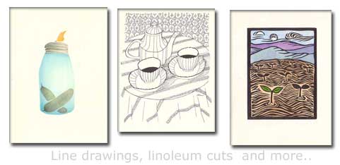
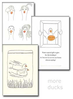
Viewers will notice that there seems to be a ducky theme to my art work. But the work of Warwick Press did not begin with ducks except for the use of a duck logo on my letterhead. There were thousands of serious, elegantly designed and printed letterheads, business cards, bookplates, envelopes, booklets, wedding invitations, and all sorts of other printed material produced for use by commercial clients. My
first Warwick Press letterhead duck motif came into being at 104
Cottage Street in Easthampton, Massachusetts, Warwick's first home.
My nine-foot wide by forty-foot long shop was piled with paper,
boxes of wooden furniture for locking up formes, an old Kluge press
badly in need of cleaning, and a foot stapler. I sat there oblivious
to the mess and made my first life-like drawing of a Pekin duck(her
name was Webby) from my childhood. The following pages display drawings made for birthdays, Valentine's Day, birth announcements, my Standing Order form, for prospectuses and for title pages. Several of the illustrations are from Warwick Press books, especially my ABC edition, "A Fowl Letter Book." See if you can pick out "B is for BABY," "P is for PAL," and "W is for WATERLILY." There are three stenciled designs for greeting cards and two linoleum cuts, one of which(seedlings with hills) appeared in a 1975 edition from the Press, "A German Requiem." PLEASE
NOTE: All of these illustrations are copyrighted and can not be
used or reproduced in any form whatsoever. Thank you for respecting
my work. |
|---|---|
 |
|
|
|